Most payout complaints were about its confusing terms and design
From our UX and CX research (interviews, support ticket analysis, usability testing), merchants are confused by the payout terminology and process on our dashboard, leading to uncertainty about when and how much they will be paid.
Design Principles
✨ Be Clear
All payout-related information must be presented straightforwardly and understandably—aligned with PayMongo's verbal identity. Use clear labels, avoid jargon, and present information in a logical sequence to reduce confusion.
⚡️ Be Consistent
Maintain uniformity in terminology and design elements across the dashboard and all touchpoints.
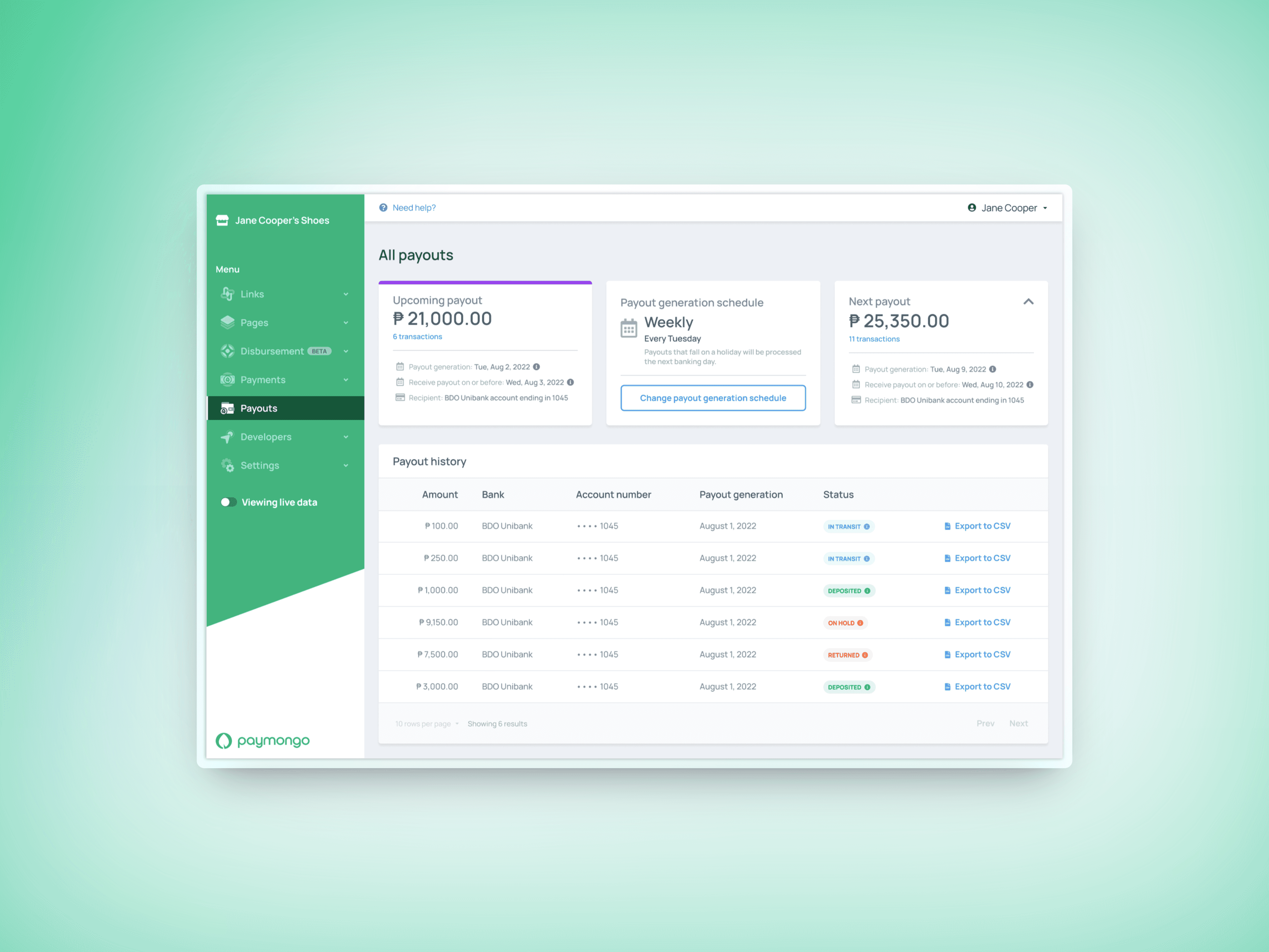
Before
I've observed that confusion in financial data causes inaccurate forecasting and poor decision-making, as merchants struggle to predict revenue and expenses, relying on unreliable information that hinders strategic choices and growth.
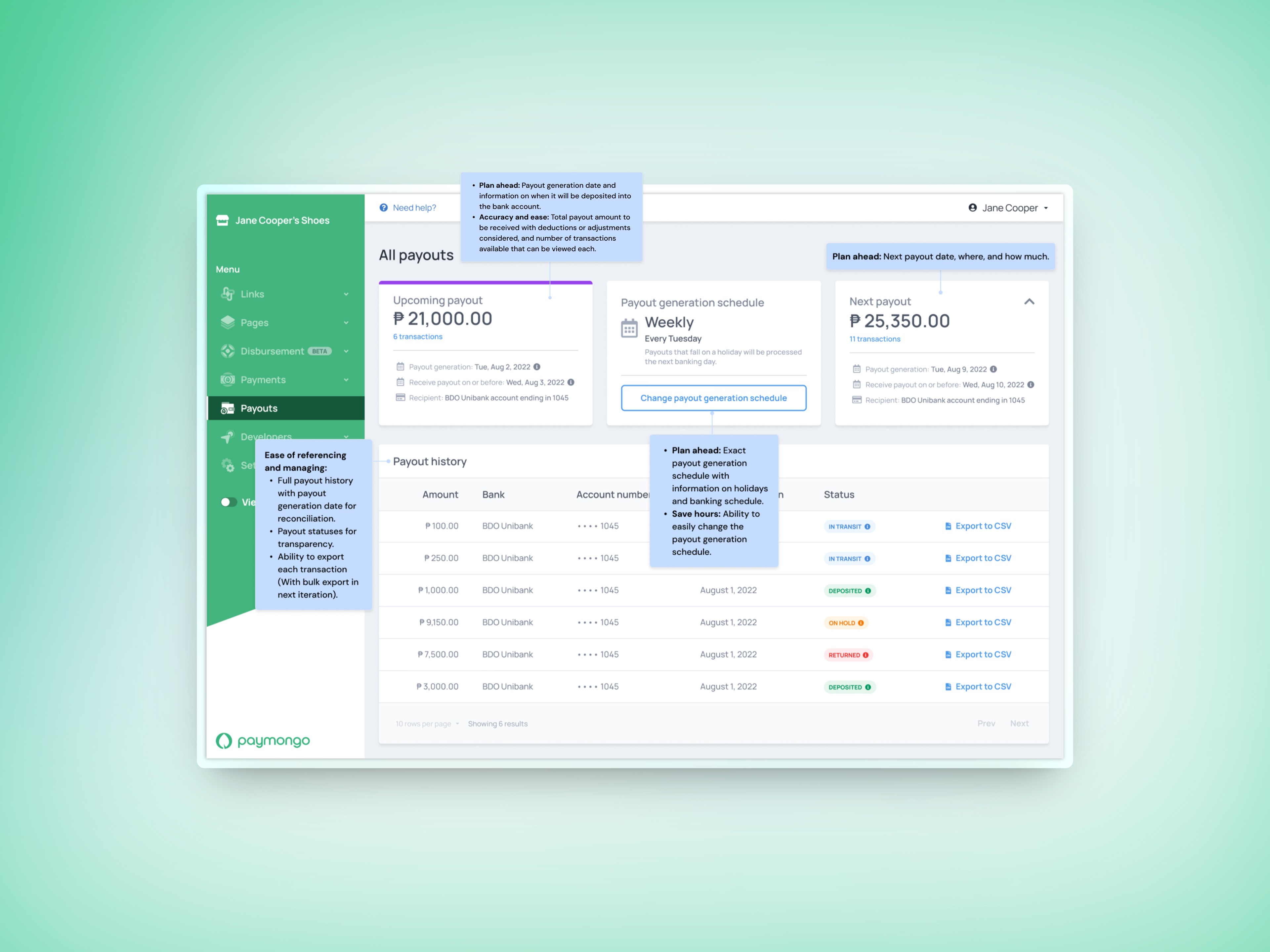
After
Showed upcoming and next payout details, including transactions, with a visible, easily adjustable payout schedule. Improved payout history by including bank details for reconciliation, statuses (e.g., in transit, deposited), and CSV export options.